Project2
Summarizations and Predictive Modeling Using News Popularity Data
Ryan Bunn & Autumn Biggie October 29, 2021
Creation Code
for(i in c("Lifestyle","Entertainment","Business","Social Media","Tech","World")){
rmarkdown::render("Project2.Rmd",output_file=i,params = list("channel"= i))
}
Introduction
For this report we looked at the online news popularity data set, collecting all articles in the Tech channel. The data set provided contains information about articles published by Mashable over 2 years. We are interested in predicting the number of shares an article gets, the shares variable, based upon its other attributes. We are particularly interested in the day of the week, number of words/tokens in the content, rate of positive words amoung non-neutral tokens, and rate of negative words amoung non-neutral tokens. For our analysis we created a total of 4 models: 2 linear regression models, 1 random forest model, and 1 boosted tree model.
The Data
First, we read in the news popularity data from the desired data channel, excluding non-predictive variables as well as variables that correspond to other data channels, calling the result data2.
In addition, we split data2 into a training (70%) and test (30%) set to be using later during model fitting, calling them train and test, respectively.
#Basic reading of data
data <- read_csv("OnlineNewsPopularity.csv")

#data of lifestyle content excluding non-predictive variables
if(params$channel =="lifestyle"){
  data2 <- data[data$data_channel_is_lifestyle == 1,] %>% select(!c(url, timedelta, starts_with("data_channel_is")))
} else if(params$channel == "Business"){
    data2 <- data[data$data_channel_is_bus == 1,] %>% select(!c(url, timedelta, starts_with("data_channel_is")))
} else if(params$channel == "Entertainment"){
    data2 <- data[data$data_channel_is_entertainment == 1,] %>% select(!c(url, timedelta, starts_with("data_channel_is")))
} else if(params$channel == "Social Media"){
    data2 <- data[data$data_channel_is_socmed == 1,] %>% select(!c(url, timedelta, starts_with("data_channel_is")))
} else if(params$channel == "Tech"){
    data2 <- data[data$data_channel_is_tech == 1,] %>% select(!c(url, timedelta, starts_with("data_channel_is")))
} else{
    data2 <- data[data$data_channel_is_world == 1,] %>% select(!c(url, timedelta, starts_with("data_channel_is")))
  }

#split data into test and train sets
set.seed(5763)
split <- sample(nrow(data2),nrow(data2)*.7)
train <- data2[split,]
test <- data2[-split,]
Summarizations
The dataset created below is the one we’ll be using to explore the data. The newspop dataset adds categorical versions of existing variables to create DayOfWeek, TokensInContent, NumShares, weekend, RateNeg, and RatePos.
newspop <- data2 %>%
  mutate(DayOfWeek =
ifelse(weekday_is_monday == 1, "Monday",
  ifelse(weekday_is_tuesday == 1, "Tuesday",
    ifelse(weekday_is_wednesday == 1, "Wednesday",
      ifelse(weekday_is_thursday == 1, "Thursday",
        ifelse(weekday_is_friday == 1, "Friday",
          ifelse(weekday_is_saturday == 1, "Saturday", "Sunday"))))))) %>%

  mutate(TokensInContent =
ifelse(n_tokens_content > 2000, ">2000",
  ifelse(n_tokens_content > 1000, "(1000,2000]",
    ifelse(n_tokens_content > 500, "(500,1000]", "[0,500]")))) %>%

  mutate(NumShares =
ifelse(shares > 25000, ">25000",
  ifelse(shares > 15000, "(15000,25000]",
    ifelse(shares > 10000, "(10000,15000]",
      ifelse(shares > 5000, "(5000,10000]",
        ifelse(shares > 4000, "(4000,5000]",
          ifelse(shares > 3000, "(3000,4000]",
            ifelse(shares > 2000, "(2000,3000]",
              ifelse(shares > 1000, "(1000,2000]", "<1000"))))))))) %>%

  mutate(weekend = ifelse(is_weekend ==1,"Weekend","Weekday" )) %>%

  mutate(RateNeg =
ifelse(rate_negative_words< .2, "Very Low",
  ifelse(rate_negative_words < .4, "Low",
    ifelse(rate_negative_words < .6, "Average",
      ifelse(rate_negative_words < .8, "High",
        "Very High")))))%>%

  mutate(RatePos =
ifelse(rate_positive_words< .2, "Very Low",
  ifelse(rate_positive_words < .4, "Low",
    ifelse(rate_positive_words < .6, "Average",
      ifelse(rate_positive_words < .8, "High",
        "Very High")))))
Contingency Tables
Below are contingency tables expressing count data for categorical variables.
Table 1: Day of the Week vs. Number of Shares
#order levels of NumShares and DayOfWeek

newspop$NumShares <- ordered(newspop$NumShares, levels = c("<1000", "(1000,2000]", "(2000,3000]", "(3000,4000]", "(4000,5000]", "(5000,10000]", "(10000,15000]", "(15000,25000]", ">25000"))

newspop$DayOfWeek <- ordered(newspop$DayOfWeek, levels = c("Monday", "Tuesday", "Wednesday", "Thursday", "Friday", "Saturday", "Sunday"))

table(newspop$NumShares, newspop$DayOfWeek, deparse.level = 2)
##                  newspop$DayOfWeek
## newspop$NumShares Monday Tuesday Wednesday Thursday Friday
##     <1000            280     357       368      329    164
##     (1000,2000]      473     572       527      502    403
##     (2000,3000]      187     211       200      206    175
##     (3000,4000]       87      91        98       78     97
##     (4000,5000]       54      60        47       55     45
##     (5000,10000]     114     113       117       98     65
##     (10000,15000]     17      47        28       17     16
##     (15000,25000]     15      15        21       18     15
##     >25000             8       8        11        7      9
##                  newspop$DayOfWeek
## newspop$NumShares Saturday Sunday
##     <1000               24     26
##     (1000,2000]        199    144
##     (2000,3000]        122     74
##     (3000,4000]         60     54
##     (4000,5000]         38     26
##     (5000,10000]        55     44
##     (10000,15000]       19     14
##     (15000,25000]        3     11
##     >25000               5      3
Table 2: Number of Words in Content vs. Number of Shares
newspop$TokensInContent <- ordered(newspop$TokensInContent, levels = c("[0,500]", "(500,1000]", "(1000,2000]", ">2000"))

table(newspop$NumShares, newspop$TokensInContent, deparse.level = 2)
##                  newspop$TokensInContent
## newspop$NumShares [0,500] (500,1000] (1000,2000] >2000
##     <1000            1027        352         149    20
##     (1000,2000]      1705        767         306    42
##     (2000,3000]       651        346         142    36
##     (3000,4000]       317        153          81    14
##     (4000,5000]       176         85          51    13
##     (5000,10000]      325        165          92    24
##     (10000,15000]      79         55          21     3
##     (15000,25000]      48         28          20     2
##     >25000             23         19           6     3
Table 3: Rate of Positive Words vs. Weekend/Weekday Status
  newspop$RatePos <- ordered(newspop$RatePos, levels = c("Very Low", "Low", "Average", "High", "Very High"))
  table(newspop$weekend,newspop$RatePos)
##
##           Very Low  Low Average High Very High
##   Weekday       29   50     632 3361      2353
##   Weekend        3    9      75  498       336
Table 4: Rate of Negative Words vs. Day of Week
  newspop$RateNeg <- ordered(newspop$RateNeg, levels = c("Very Low", "Low", "Average", "High", "Very High"))
  table(newspop$RateNeg,newspop$DayOfWeek)
##
##             Monday Tuesday Wednesday Thursday Friday
##   Very Low     385     504       517      443    306
##   Low          683     794       721      722    554
##   Average      145     163       159      135    116
##   High          18      13        17        8     12
##   Very High      4       0         3        2      1
##
##             Saturday Sunday
##   Very Low       191    115
##   Low            287    229
##   Average         38     48
##   High             8      3
##   Very High        1      1
Table 5: Rate of Positive Words vs. Number of Shares
table(newspop$RatePos,newspop$NumShares)
##
##             <1000 (1000,2000] (2000,3000] (3000,4000]
##   Very Low      3          12           4           4
##   Low           7          26          12           4
##   Average     147         268         115          43
##   High        759        1514         602         313
##   Very High   632        1000         442         201
##
##             (4000,5000] (5000,10000] (10000,15000]
##   Very Low            3            4             1
##   Low                 3            6             0
##   Average            33           72            17
##   High              175          321            85
##   Very High         111          203            55
##
##             (15000,25000] >25000
##   Very Low              1      0
##   Low                   0      1
##   Average               8      4
##   High                 60     30
##   Very High            29     16
Numerical Summaries
Below we explore numerical summaries of the data, grouping by different variables.
Summary 1: Number of Images and Videos Grouped by Number of Shares
newspop %>% group_by(NumShares) %>% summarise(avg_Images = mean(num_imgs), sd_Images = sd(num_imgs), avg_Videos = mean(num_videos), sd_Videos = sd(num_videos))
Summary 2: Number of Shares Grouped by Number of Words in Content
newspop %>% group_by(TokensInContent) %>% summarise(avg_shares = mean(shares), sd_shares = sd(shares))
Summary 3: Number of Shares Grouped by Day of the Week and Number of Words in Content
newspop %>% group_by(DayOfWeek, TokensInContent) %>% summarise(avg_shares = mean(shares), sd_shares = sd(shares))
Summary 4: Number of Shares Grouped by Rate of Positive Words
newspop %>% group_by(RatePos) %>% summarise(min_shares = min(shares), max_shares = max(shares),avg_shares=mean(shares), sd_shares=sd(shares))
Summary 5: Number of Shares Grouped by Weekday/Weekend Status and Rate of Positive Words
newspop %>% group_by(weekend,RatePos) %>% summarise(min_shares = min(shares), max_shares = max(shares),avg_shares=mean(shares), sd_shares=sd(shares))
Graphical Summaries
Next we explore the data visually using graphical summaries.
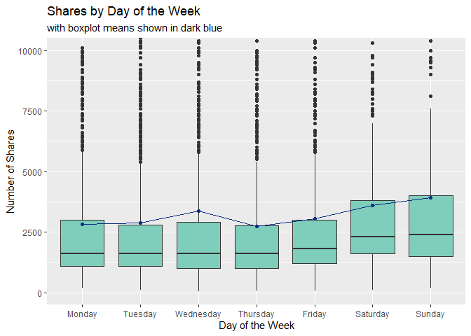
Plot 1: Boxplot of Shares vs. Day of the Week
The boxplot below shows how the number of shares are distributed for each day of the week. Larger boxes indicate more variability, so patterns we may want to look for are:
- Does the variability of each boxplot change depending on the day of the week?
- Are the medians of each boxplot generally consistent?
- Are the mean values (depicted in dark blue) similar to the median values or are they heavily affected by outliers?
summed <- newspop %>% group_by(DayOfWeek) %>% summarise(avg_shares = mean(shares))

#note that this boxplot does not show a significant number of outlier values in order to get a better view of the boxes

#the line connecting boxplots shows mean value for each
ggplot(newspop, aes(x = DayOfWeek, y = shares)) +
  geom_boxplot(fill = "#7fcdbb") +
  coord_cartesian(ylim = c(0,10000)) +
  geom_point(summed, mapping = aes(x = DayOfWeek, y = avg_shares), color = "#0c2c84") +
  geom_line(summed, mapping = aes(x = DayOfWeek, y = avg_shares, group = 1), color = "#0c2c84") +
  labs(title = "Shares by Day of the Week", subtitle = "with boxplot means shown in dark blue", x = "Day of the Week", y = "Number of Shares")
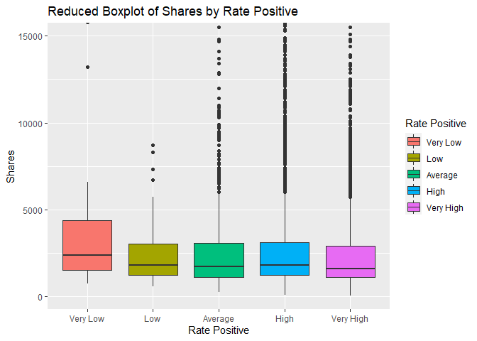
Plot 2: Shares vs Rate Positive boxplot
The boxplot below shows the number of shares compared to the five classes of the rate of positive words we created above. We are interested in comparing the 5 different groups and how the rate of positive words may affect the number of shares a story recieves. If there is little to no effect, all of the boxes will be in approximately the same position.
ggplot(newspop, aes(x = RatePos,y = shares))+geom_boxplot(aes(fill = RatePos)) +
  coord_cartesian(ylim = c(0,15000))+labs(x="Rate Positive", y = "Shares", title="Reduced Boxplot of Shares by Rate Positive")+scale_fill_discrete(name="Rate Positive")
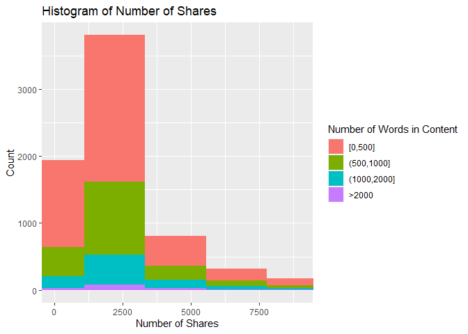
Plot 3: Histogram of Number of Shares vs. Number of Words in Content
This histogram shows how the number of shares are distributed based on the number of words in the article. If the data is right skewed, then most articles had a lower number of shares, and the inverse is also true. In addition, the amount of a certain color on the histogram shows how the number of shares is associated with article length. For example, if there is a lot of red near the lower values of the x-axis, then that means there were a lot of articles with a low number of shares and fewer than 500 words.
ggplot(newspop, aes(x = shares, fill = TokensInContent)) +
  geom_histogram(bins = 300) +
  coord_cartesian(xlim = c(0, 9000)) +
  labs(title = "Histogram of Number of Shares", x = "Number of Shares", y = "Count") +
  scale_fill_discrete(name = "Number of Words in Content")
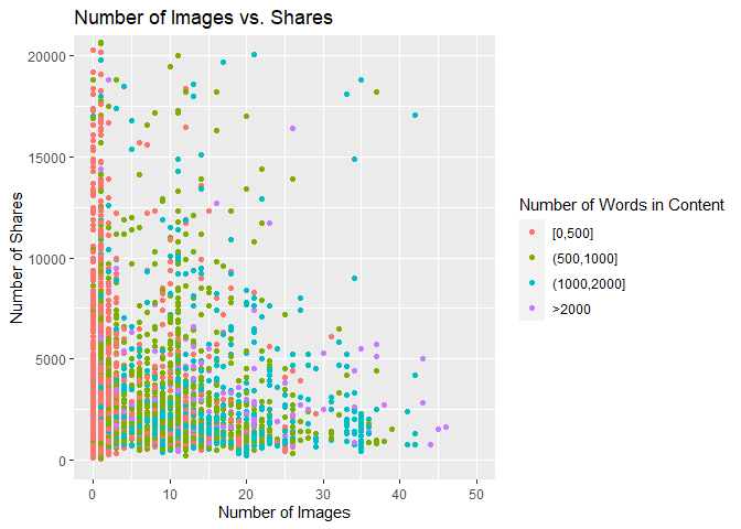
Plot 4: Scatter Plot of Number of Images vs. Number of Shares
The scatter plot below shows the relationship between the number of images in the article and the number of times the article is shared. If the points follow an upward trend, then articles with more images tend to be shared more often. If the points follow a downward trend, articles with more images tend to be shared less often. If there is no visible pattern, there may be no relationship between the two variables for this data channel.
ggplot(newspop, aes(x = num_imgs, y = shares)) +
  geom_point(aes(color = TokensInContent)) +
  coord_cartesian(xlim = c(0,50), ylim = c(0,20000)) +
  labs(title = "Number of Images vs. Shares", x = "Number of Images", y = "Number of Shares") +
  scale_color_discrete(name = "Number of Words in Content")
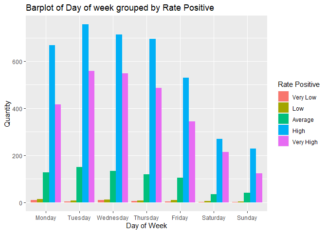
Plot 5: Barplot of Number of articles grouped by Rate Positive and the Day of the week.
In the barplot below we are interested in seeing if there is any relationship between the Rate of Positive words in an article and the day of the week when an article is published. In addition, we can see the days articles are more likely to be published and the Rate Positive groups that publishers prefer.
ggplot(newspop,aes(DayOfWeek))+geom_bar(aes(fill=RatePos), position = "dodge")+labs(x= "Day of Week", y = "Quantity", title = "Barplot of Day of week grouped by Rate Positive")+scale_fill_discrete(name="Rate Positive")
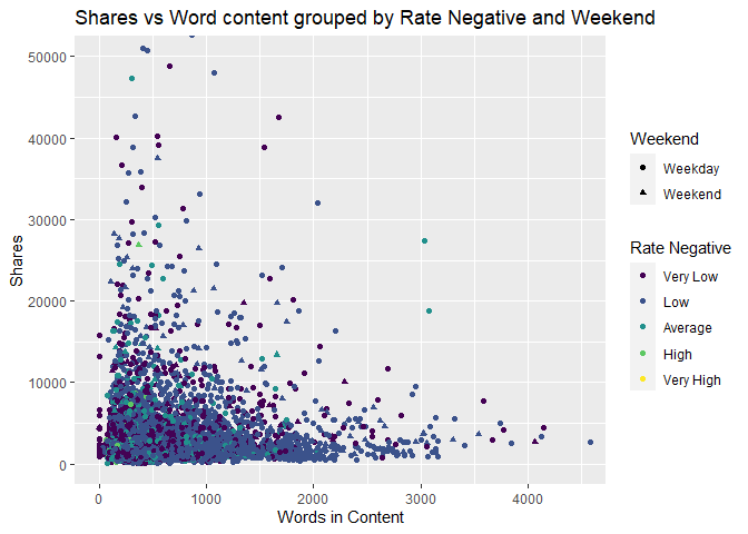
Plot 6: Scatter Plot of number of shares grouped by Rate of Negative words and Weekend status.
The scatter plot below shows several different relationships between shares, Rate of Negative words and weekend vs weekday. If we can see a clustering of shapes and colors that are the similar it can show a relationship between the posting date, shares, and the Rate of Negative words in the articles.
ggplot(newspop,aes(x=n_tokens_content,y=shares))+geom_point(aes(color=RateNeg,shape=weekend))+coord_cartesian(xlim=c(0,4500),ylim = c(0,50000))+labs(x="Words in Content", y="Shares",title="Shares vs Word content grouped by Rate Negative and Weekend", color="Rate Negative",shape="Weekend")
Modeling
In this section, we explore different modeling techniques to fit the data. This is where we’ll employ the use of our train and test datasets we created initially. All models are compared at the end of the document.
Linear Regression
The Linear Regression technique attempts to model a response y by the predictors xi. A simple linear regression model is of the general form
Yi = β0 + β1xi + Ei
, but multiple linear regression models can include terms that square the predictors or capture interactions between different predictors. A linear regression model is fit by minimizing the sum of squared residuals, that is, choosing β0, β1, …, βi that minimize the square of the observed - predicted values. It is called a “linear” regression model not because the relationship between the response and predictors is linear, but because each βi is of the first power.
Linear Regression Fit 1:
fit_lr <- lm(shares ~ n_tokens_content + n_non_stop_words + num_hrefs + num_self_hrefs + num_videos + kw_avg_avg + self_reference_min_shares + weekday_is_monday + n_tokens_content:num_hrefs + n_tokens_content:num_videos + num_hrefs:num_videos + num_self_hrefs:num_videos + n_tokens_content:kw_avg_avg + n_non_stop_words:kw_avg_avg + n_tokens_content:self_reference_min_shares + num_videos:weekday_is_monday + n_tokens_content:num_self_hrefs:num_videos + I(num_videos^2), data = train)
Adj R2: 0.0209757 Residual SE: 1.031382910^{4}
Linear Regression Fit 2:
#variables with correlation .75 and higher removed
fit_lr2 <- lm(shares~.-n_unique_tokens-n_non_stop_words-kw_max_min-kw_min_min-kw_max_max-kw_max_avg-self_reference_min_shares-self_reference_max_shares-global_rate_negative_words-rate_positive_words ,data=train)
Adj R2: 0.0249595 Residual SE: 1.031398510^{4}
Random Forest
The Random Forest method for fitting a regression model is similar to the Bagged Tree method. Like the Bagged Tree method, multiple bootstrap samples are taken from the original sample, and a tree is created from each sample. However, the Random Forest method creates the tree using m randomly chosen predictors for each sample instead of all predictors every time. This increases independence between trees, leading to a reduction in variance when the results are averaged. This is especially important when there exists an especially strong predictor in the dataset.
rf_fit <- train(shares ~ ., data = train,
            method = "rf",
            preProcess = c("center", "scale"),
            trControl = trainControl(method = "cv", number = 10),
            tuneGrid = expand.grid(mtry = c(1:15))
)

rf_fit$bestTune
Boosted Tree
The Boosted Tree method of model fitting uses the idea of growing many trees sequentially. First a tree is created and then additional trees are grown and modified based upon the previous trees and several tuning parameters. The tuning parameters help to ensure that the tree does not “grow” too quickly and overfit the training data. For our analysis we set the number of trees and interaction depth as our tuning parameters that influence our trees.
bt_fit <- train(shares ~ ., data = train,
            method = "gbm",
            preProcess = c("center", "scale"),
            trControl = trainControl(method = "cv", number = 5),
            tuneGrid = expand.grid(n.trees=c(50,100,200,250),interaction.depth=1:5,shrinkage=.1,n.minobsinnode=10),
            verbose=FALSE
)
Comparison
Lastly, we compare the models fitted using the train data above by running them on the test dataset.
#run linear model 1 on test set
test_lr1 <- lm(shares ~ n_tokens_content + n_non_stop_words + num_hrefs + num_self_hrefs + num_videos + kw_avg_avg + self_reference_min_shares + weekday_is_monday + n_tokens_content:num_hrefs + n_tokens_content:num_videos + num_hrefs:num_videos + num_self_hrefs:num_videos + n_tokens_content:kw_avg_avg + n_non_stop_words:kw_avg_avg + n_tokens_content:self_reference_min_shares +   num_videos:weekday_is_monday +  n_tokens_content:num_self_hrefs:num_videos + I(num_videos^2), data = test)

mse1 <- mean(residuals(test_lr1)^2)
lr1_rmse <- sqrt(mse1)

#run linear model 2 on test set
test_lr2 <- lm(shares~.-n_unique_tokens-n_non_stop_words-kw_max_min-kw_min_min-kw_max_max-kw_max_avg-self_reference_min_shares-self_reference_max_shares-global_rate_negative_words-rate_positive_words ,data=test)

mse2 <- mean(residuals(test_lr2)^2)
lr2_rmse <- sqrt(mse2)

#run random forest model on test set
pred1 <- predict(rf_fit,test[,1:52])
rf_RMSE <- RMSE(pred1,test$shares)

#run boosted tree model on test set
pred2 <- predict(bt_fit,test[,1:52])
bt_RMSE <- RMSE(pred2,test$shares)

#create vectors to form DF
rmse_vec <- c(lr1_rmse, lr2_rmse, rf_RMSE, bt_RMSE)
rmse_labs <- c("Linear Model 1", "Linear Model 2", "Random Forest Model", "Boosted Tree Model")

#create dataframe for easy comparison of model RMSE
comp <- data.frame(rmse_labs, rmse_vec) %>% rename(Model = rmse_labs, RMSE = rmse_vec)
comp
According to the comparison chart above, the lowest RMSE value is 4229.7010497, corresponding to the Linear Model 2. Of the models we have explored above, the Linear Model 2 is the best model for the data from this channel.